Tell Me What’s A-Happening: Defining Dashboard Reporting Requirements
Defining requirements for interactive dashboard displays is trickier than specifying individual reports and graphics

A dashboard is a screen display or printed report that uses multiple data representations to provide a consolidated, multidimensional view of what’s going on in an organization or a process. The elements of a dashboard display can include tables, charts, spreadsheet elements, textual reports, and other visual components in any combination.
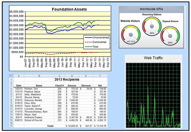
Companies use dashboards to pull together information about sales, expenses, key performance indicators, and the like. Business analytics projects often use dashboard displays to help users make decisions based on analyses of complex data sets. Stock trading applications display a bewildering (to the novice) array of charts and data that the skilled eye can scan and process at a glance. Certain displays in a dashboard might be dynamically updated in real time as input data changes. Figure 1 shows a hypothetical reporting dashboard for a charitable foundation, with a variety of presentation techniques being used.
Broad Strokes
Specifying the requirements for a dashboard is more involved than defining individual reports. There can be interconnections among the elements in the display that require synchronizing updates whenever the values in one element change. Users might need sophisticated and flexible manipulation controls so they can customize the appearance and play with the data in diverse ways. This article suggests ways for a business analyst to approach understanding the requirements for dashboard reporting.
Exploring the requirements for a dashboard involves the following sequence of elicitation and analysis activities. Many of these activities also are useful when specifying individual reports.
Determine what information the dashboard users need for making which decisions or choices. Understanding how the presented data will be used helps you choose the most appropriate display techniques.
Identify the sources where all the data to be presented will be coming from so you can ensure the application has access to those feeds. Determine whether the data feeds are static or dynamic, changing in real time.
Choose the most effective type of display for each set of related data. Should it appear as a simple table of data, a modifiable spreadsheet with formulas, blocks of text, a chart (bar, pie, line), video display, or some other way to present information?
Determine the optimal layout and relative sizing of the various displays in the dashboard, based on how the user will absorb and apply the information.
Down to Specifics
Once you’ve determined what information should appear in each dashboard element and the overall layout, specify the details of each such display. Provide enough information for each display so a developer can understand the functionality users will need to work with their data dynamically, not simply to view it. Following are some additional topics you might want to explore about each display variant:
If the displayed data is dynamic, how frequently must the data be refreshed or augmented, and in what way? For instance, does the current data scroll to the left as new information is added to the right end of a fixed-width window?
What parameters should the user be able to change to customize a display, such as a date range?
Does the user want any conditional formatting to have sections of a display change based upon the data? This is helpful when creating progress or status reports: use green if the data meets the criteria for “good,” yellow to indicate “caution,” and red for “Whoa, this is messed up!” When using colors in a display, also use patterns, to accommodate viewers who have difficulty distinguishing colors and those who print and distribute the display in monochrome.
Which displays will need horizontal or vertical scrollbars?
Should the user be able to enlarge any display in the dashboard to see more detail? Should she be able to minimize or close displays to free up screen space?
Must the user’s customizations persist across usage sessions, possibly in a configuration profile?
Will the user want to alter the form of any of the displays, perhaps to toggle between a tabular view and a graphical view?
Will the user want to drill down in any of the displays to see a more detailed report or the underlying data?
Details, Details
As the business analyst who’s eliciting and specifying this kind of information, you’ll need to exercise judgment to decide how much detail should be documented in writing versus communicated verbally. Developers, testers, and users must all share a common expectation of what’s being built.
I’m in favor of using written specifications to provide a shared group memory of the decisions made. Those specs need not be any more formal or rigorous than necessary to make sure there’s no confusion. You can save time by referring to other existing systems that have used similar functionality or characteristics, rather than re-documenting existing organizational knowledge in great detail.
Since a dashboard is basically an agglomeration of multiple reports, you need to understand the details about each element of the dashboard. Following are some questions to explore for each such element.
What is the name of the report?
What are the sources of the data and the selection criteria for pulling data from the repository?
What calculations or other data transformations are required?
What are the criteria for sorting, page breaks, subtotals, and totals?
How should the system respond if no data is returned in response to a query when attempting to generate this report?
Should the underlying data of the report be made available to the user for ad hoc reporting?
Are there security, privacy, or management restrictions that limit the access of the report to specific individuals or user classes, or which restrict the data that can be included in the report depending on who is generating it? Identify any relevant business rules concerning security.
Prototyping
Prototyping a dashboard is an excellent way to work with stakeholders to ensure that the layout and presentation styles used will meet their needs. You can sketch out possible display components on sticky notes and have the stakeholders move them around until they find a layout they like. A simple mock-up or paper prototype like this facilitates iteration, a powerful aid for both refining the requirements and exploring design alternatives. Constructing and evaluating a prototype is cheaper than building the “real” product and then rebuilding it until you get it right.
As usual with requirements specification, the amount of detail to provide when specifying reports or dashboards depends on who makes decisions about their appearance and when those decisions are made. The more of these details you’re willing to delegate to the designer, the less information you need to supply in requirements. And, as always, close collaboration among the BA, user representatives, and developers will help ensure that everyone is happy with the outcome.
This article is adapted from Software Requirements by Karl Wiegers and Joy Beatty. Karl’s latest book is Software Requirements Essentials: Core Practices for Successful Business Analysis (co-authored with Candase Hokanson). He’s also the author of Software Development Pearls, The Thoughtless Design of Everyday Things, Successful Business Analysis Consulting, and numerous other books.


